Rendering certain content on your smartphone, to be integrated with the car’s native user interface, leads to an inconsistent user experience.
CarPlay essentially mirrors content from the user’s smartphone to their car’s dashboard. The idea being that cars, which are in use for over a decade, can’t always sport the latest tech. Instead of replacing your car, you can just update your iPhone and have access to applications that didn’t originally ship with the car.
The issue, however, is that two worlds are colliding here: the world of the car maker, and Apple’s world of iOS and CarPlay, with its own design language and user experience (UX) patterns.
Let’s look at this image of the user interface on a Audi Q4 E-Tron. What are we seeing here? This is Audi’s in-car relaxation app that connects to your Apple Watch to measure your heart rate and then coaches you to drive more calmly.
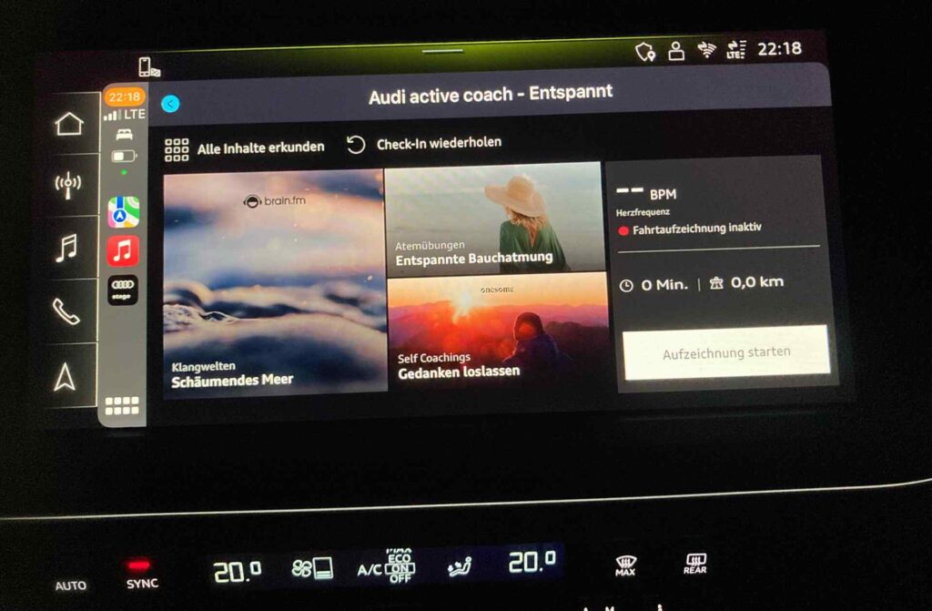
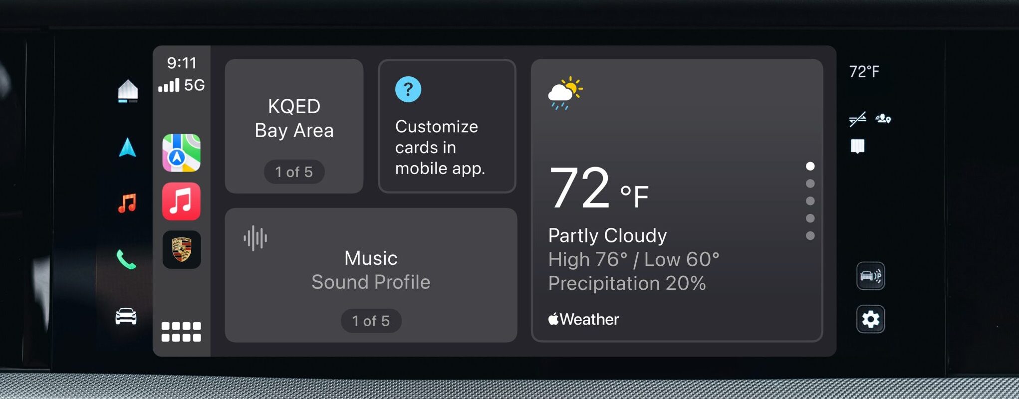
We also see a navigation bar on the left, providing quick access to things like the music or navigation apps on the car. Next to that, we see another navigation bar, in a totally different style, but also using a musical note as an icon for access to music. It is located directly next to the other music icon, so there are two “music” apps, one native to the car, one in CarPlay. We also see two clocks, showing the same time and two “LTE” signal strength indicators. And then, there are three home buttons. There’s the house icon at the very left that takes the user to the car’s app overview, there’s Apple’s 8-tile button at the bottom left of the CarPlay window that takes the user to the app launcher in CarPlay, and there’s another similar icon at the top left of the “Audi Stage” app in CarPlay that will take the user to a selection of apps within the Audi Stage app.
Essentially, we’re seeing an app within an app within an app.
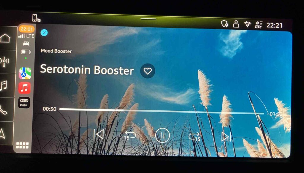
But it gets worse. Selecting one of the experiences in the app will take the user to yet another screen inside the embedded relaxation app inside the wider Audi app inside CarPlay inside the greater Audi Human Machine Interface (HMI). There’s now a “x” close button at the top left corner of this, but I think at this point it’s not really understandable what the user is closing. We are just too many levels down, that all have their own design patterns. Apple clearly uses a different design language than Audi.
CarPlay (and also Audi’s MMI (multi-media interface)) is supposed to be designed in a way to minimize driver distraction, but this is doing the opposite. The idea of this relaxation app is turned upside down and has the opposite effect, because when using this app, the driver needs to do mental gymnastics, understand the meaning of those different application “worlds.” It simply sucks.
But why is this happening?
Let’s look at the underlying architecture to get a clue.
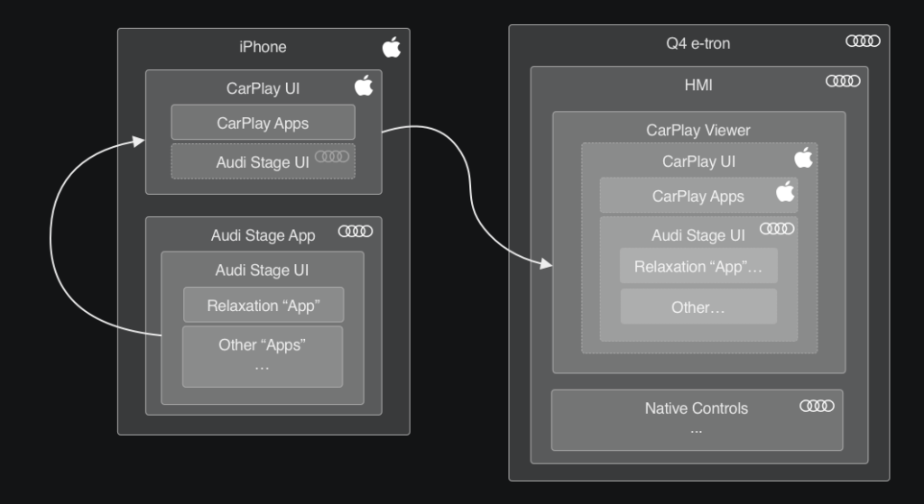
This is a simplified view of what’s happening, but in a nutshell, the relaxation app lives within the Audi stage app, which is then shown as part of the CarPlay content. CarPlay renders the content on the iPhone and the Car shows the video stream in a window, sending user input back to the car.
The decision for this was presumably made because it’s easier to update a mobile app than updating a native app within the vehicle. The mobile app can also access data that the vehicle itself can’t (e.g. the heart rate from the driver’s Apple Watch).
The Audi designers made the most of the constraints of the Audi Stage app, by showing multiple “apps” within it. Apple’s CarPlay designers made the most of the constraints of their CarPlay window within the Audi MMI, showing their own UI with an Apple UX. From the CarPlay perspective, the Audi Stage app is a single app amongst multiple “native” CarPlay apps. But then once the content is shown on the car’s display, the CarPlay view is actually one app amongst multiple apps that are “native” to the car. If this sounds like some weird sci-fi-portal type stuff, that’s because it is. We live in the future and the future sucks.
A well-designed user experience is consistent and easy to understand. This is the opposite.
Looking at the architecture explains the inconsistent UX. But the fact that designers at different companies can point fingers at each other doesn’t matter. The fact that designers at Audi didn’t have control over the CarPlay UI and that designers at Apple didn’t have control over due Audi UI is noted but irrelevant. What is relevant is that it’s not a great experience and users have to deal with things they shouldn’t have to deal with.
A well-designed user experience is consistent and easy to understand. This is the opposite. This Audi-in-Audi-in-Apple-in-Audi user experience is redundant, confusing and inconsistent, uses similar iconography for slightly different features, and constantly requires the user to understand the underlying Russian-dolled software architecture to be able to navigate it.
Well-executed UX requires bringing all involved domains together.
Apple has announced the “next generation CarPlay” experience earlier this year, promising tighter integration that, ideally, will solve these issues. But will it?
To properly fix this, we need a way to allow designers to create applications that are design-independent, that then get rendered as part of a consistent UI system, without designers even knowing what it’ll look like in the end. If the CarPlay UX is updated, applications should adapt their look & feel, without requiring changes to the individual application’s code.
We’ll also need a way for CarPlay to better adapt to a vehicle’s unique UX and design language. Audi isn’t the only one. Here is a similar issue in a Volvo.
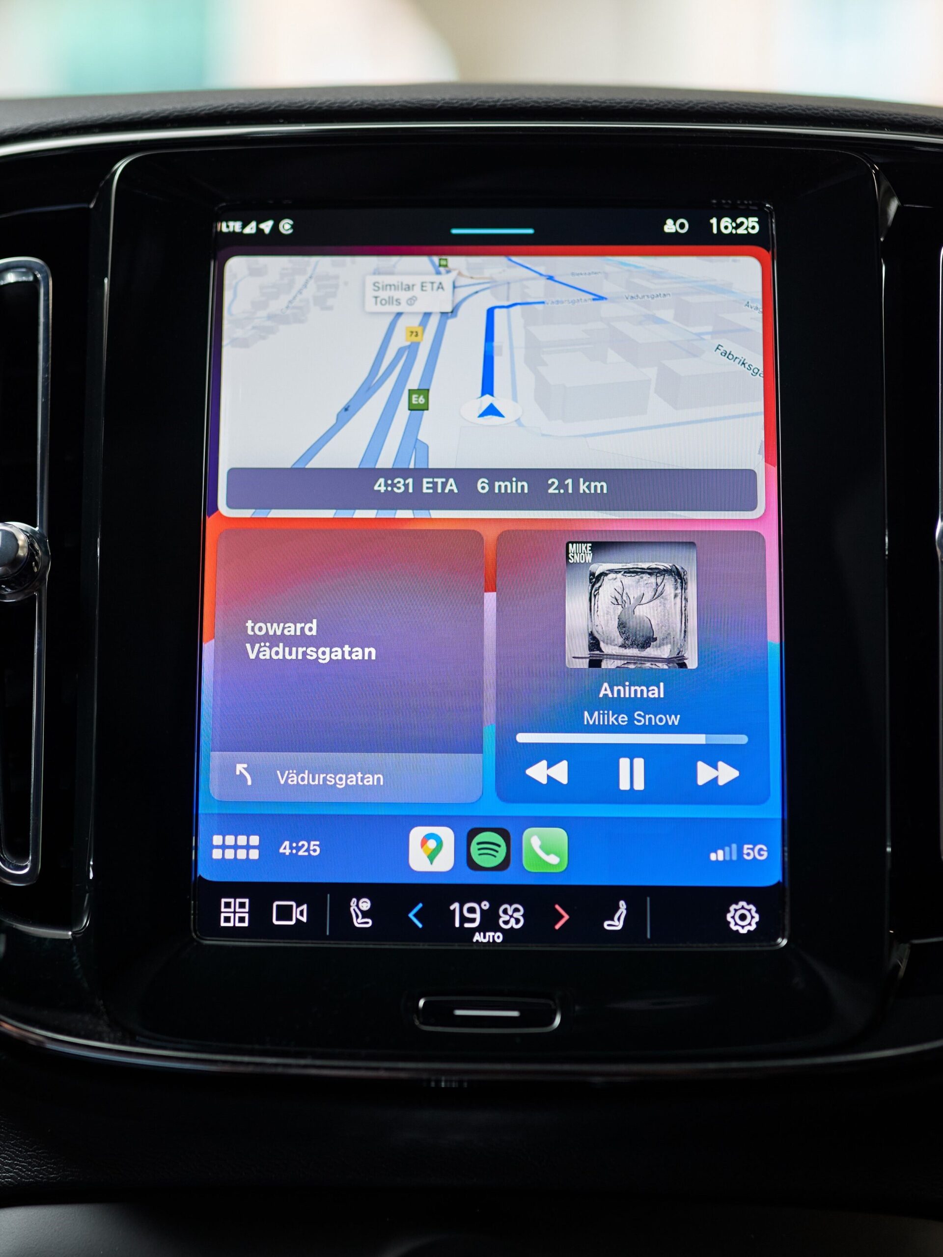
We have a “home” button from Volvo (four empty squares) and another “home” button from Apple (eight rounded squares) right next to each other. And we also have two clocks, with one showing 24-hour time and the other showing 12-hour time.
CarPlay has allowed car companies to take some shortcuts to get features into their cars that they otherwise wouldn’t have. But the whole experience doesn’t feel very integrated, but duct-taped on.
And this, my children, is why cars have Frankenstein UX now.
Images in this article are licensed for editorial use from Porsche and Volvo. User interfaces by Apple, Audi, Porsche and Volvo are shown for editorial purposes.
Leave a Reply