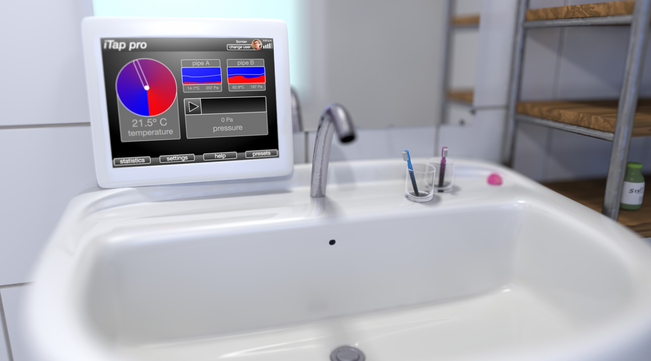
Advances in user interface development enable the inception of whole new categories of products. It’s tempting to apply these smart innovations to other products, without an inherent need to do so from the user experience perspective.
As products become more short-lived, not only in terms of durability but also in terms of technological novelty, it’s easier to place a product on the market that incorporates the latest “fashion” trends, instead of a product that is, at its core, based on through user experience research and development. I think, customers don’t inherently know what’s good for them. You can put a car in a showroom that, at the first glance, looks advanced, but after driving a thousand miles already annoys the user with its UI quirks. I observe a dangerous development in just about any category of product away from a focus on long-term usability, towards short-term fads. Here’s the thing: I’m an innovation advocate, but there is a difference between innovation for the sake of improving user experience and innovation for innovation’s sake. The user interface is the connection between the functionality of your product and its users. Because of that, it’s the starting point for attempts to make the product seem more advanced and is most susceptible to ingenuous user experience engineering decisions. I love touch-screens. They enabled a whole new range of devices. But simply deciding to use a touchscreen because it makes the iPhone a great device doesn’t necessarily make a touchscreen the right choice for whatever device you have in mind. There are basically two approaches to engineering: the first one is thinking about the cool stuff you want to build and what technology you need for it, the second is looking at the cool technology available and thinking about what you can do with it. ? product idea → ?UI solution ?UI solution →? product idea I’m not condemning the second approach. The problem isn’t getting inspired by technology. The problem is sticking with the user interface approach that inspired your product innovation because you think it’s a fundamental part of your product’s functionality. But, it’s not! When starting to develop their Watch, Apple had the most advanced touchscreen technology available and thus, just like it started the original Idea of the iPhone, it became a fundamental aspect of the new product. Yet, even though apple’s portfolio seemed to proof that the market for devices that were primarily controlled with touch-screens was insatiable, the new wearable addition to the line-up incorporated something seemingly archaic as a crown. The Digital Crown isn’t there because touch-screens suck, it isn’t there because Apple wanted to be old-fashioned. It is there because, after extensive research and development it turned out to be the best solution. ? product idea → ? UI solution → ? ? UI solution →? product idea → ? ? UI solution →? product idea → ⌚️ new UI solution → ? Your product is about what it does for the user. Its user interface should be designed to allow the user to use your product effortlessly, in all situations and without a steep learning curve. I’m not saying, we need to do things the old way for the sake of it either. Developing a product requires you to balance between the temptations and possibilities of new technologies and the actual needs of the user. Some approaches to user interface are outdated for a reason, some are not and just because something worked for a different use case, it means it’s the best solution for your particular product.

No, that’s not the right approach either.
When having a product in mind, one might think about the user interface first, because it’s obvious. But none of the user stories you’ll incorporate into the fundamental design decisions of your product should have anything to do with the user interface. Imagine a car with an air conditioning system. If you make up a user story like “The user wants to slide on the touchscreen to adjust the temperature”, your decision on how to approach it will already be biased. Even “The user wants to adjust the air conditioning” is already making you think inside a box. Even though most car designers will implement one or another way to adjust the AC in the car, a user story like “the user feels uncomfortable with the interior temperature” will allow you to think freely and make design decisions that are independent from any technical preconceptions.
Do research!
So what is the formula for finding the right way? It’s obvious: let the people who know how to do it do their job! Let researchers do research! If I would be a nerd (and I am) and you would ask me to, say, design the interior of a car, I would probably put the biggest possible touch-screen in there because I think it’s cool. I’m a already thinking in terms of solutions instead of user stories. If you would ask me to responsibly create the best approach to the user story “Someone wants to open the panoramic sun-roof”, although thinking about a touch-screen, I’d do research to make sure what the best approach is. It’s a misconception that the large, established, companies in the automotive and other industries can’t innovate because of their processes and bureaucracy. let me put it this way: they often don’t “innovate” because the research that is part of their development process indicates that the “innovation” might not be a good idea. So, in a way, it’s true that the process prevents the “innovation” but again, there’s a difference between real innovation that gives customers new functionality or simplifies the operation and false innovation that overcomplicates things or even reduces the functionality. I never understood the point about touch-field “buttons” on monitors. I can blindly switch inputs on a monitor with buttons and the touch-fields have nothing but drawbacks. They did’t even lead to a clean design, because instead of the buttons, we now need marks to tell the user where to press. If I want to get rid of the buttons, replacing the buttons with something less efficient like the touch fields doesn’t help. (On a side note: Apple has realized how to reduce the switches on monitors for decades as functionality like the panel brightness can be controlled right from the OS.). Back to the sunroof example: The real innovation and benefit for the user is the sunroof itself. If you increase the area, you improved the product. If you let it close faster, you improved it. If you improved the way people can interact with it and allow them to open it faster, you improved it. In an Audi, opening the sunroof is done via a switch in the overhead controls at the front of the sun-roof that needs to be pulled back to move the sunroof back. It’s simple, yet effective, because people, when they want to open the sunroof, want to push something up there back. This allows anyone who has never been in the car to intuitively find the sun-roof control without looking away from the road for one second. This switch exists not because Audi can’t buy big touch-screens and put them in their cars to control everything, but because, after experimenting with touch-screens, knobs, switches, gesture control and other approaches, and after taking all relevant factors like driver distraction, cost, and target group expectations into account, they decided to leave things the old fashioned way and perfect the switch, like Apple perfected the watch crown. Requiring the driver to operate a touch-screen to find a sub-menu is a step back. This doesn’t mean that an iPad isn’t cool because it has a touchscreen. When developing a product it’s not about doing the coolest possible thing, the most old-fashioned or most technologically advanced thing. It’s about doing the right thing. And finding out what that is takes research. Lots and lots of research. I’m not going to explain user experience research here. I’m just calling upon the UX Designers of this world: Even though the new possibilities are tempting, the rules haven’t changed. Products are still made for the same people, and even though there are new technologies available, they need to be incorporated wisely. The technology shall serve the users and no the other way around. Side note: I’m aware of the fact that the sun-roof in a Tesla Model S can be controlled via the steering wheel as well. That’s a good decision.

Leave a Reply