This is an ode to pixel-perfect graphics and an explanation as to how, even with advancing technology, they still hold importance.
Great graphic design for embedded systems should take the the characteristics of the target display and environment into account.
This article is directed at individuals who work in embedded systems and user interfaces but do not specialize in the graphics pipelines.
A brief history of Pixels
Historically, displays in embedded systems didn’t have pixels. Instead, they had segments which often contained entire phrases or icons, such as the check engine light in many cars (). Sometimes the segments were part of different possible shapes. These display segments later evolved in to pixels that were arranged in a grid-pattern and, depending on the density, allowed display of arbitrary graphics.
In the dark ages of embedded user interfaces, designers used to fight over every single pixel (or display segment). They needed to be aware of how individual display segments could be switched to create the desired patterns.
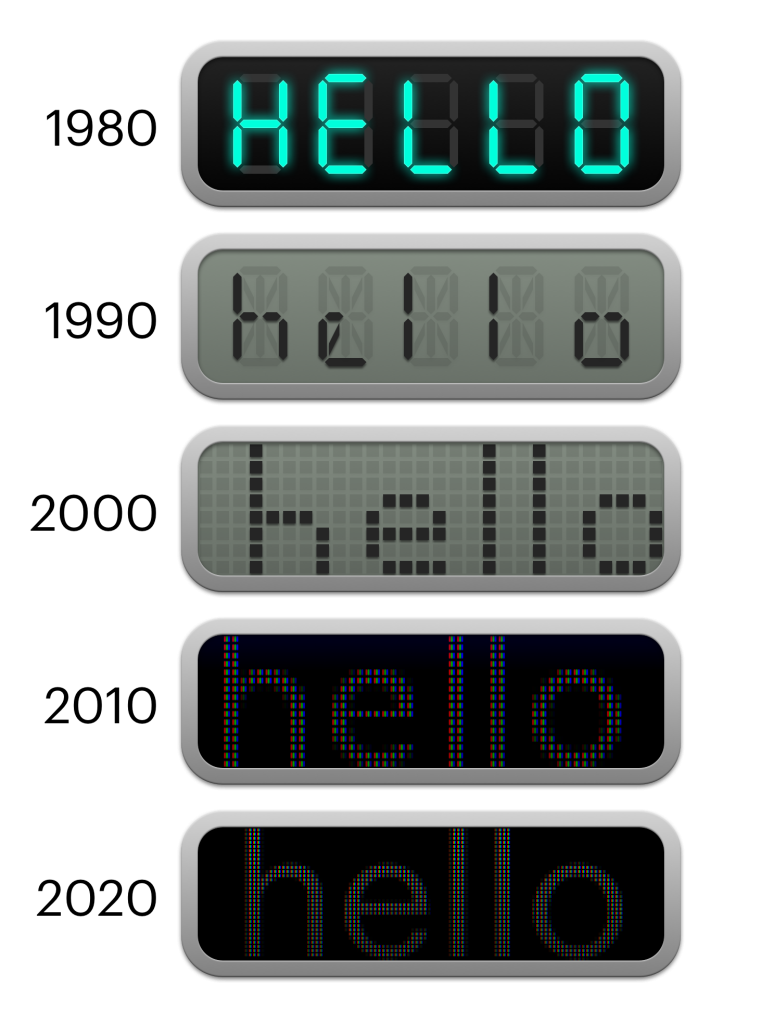
Now we have large, high-resolution displays with lots of pixels. We have vector graphics that can be re-sampled as required and user interface middleware that takes care of scaling and different DPIs for developers and designers. One could say that technology has advanced sufficiently that we don’t have to worry about addressing individual display segments/pixels anymore.
As I will explain here, however, all those technical advancements are not yet a substitute for pixel-perfect graphics.
Let’s start from the beginning:
What are pixel-perfect graphics?
Pixel-perfect graphics are graphics designed for the characteristics of the pixel pattern (pixel geometry) of the target display. In the most simple form, a pixel-based image of a certain resolution would take exactly as many pixels on the screen, with one pixel of the image corresponding to one pixel of the screen. Pixel-perfect graphics may make use the characteristics of the pixel geometry to create patterns or fine details.
There are many use-cases where pixel-perfect graphic design would be a hindrance to design. Pixel-perfect isn’t a universal solution but should be applied on a case-by-case basis.
On a display that has as a grid of square pixels, when pixel-perfect graphics get scaled (by numbers that aren’t powers of two), rotated (by anything other than 90º steps) or moved (by anything other than integer numbers), the graphics will no longer be pixel-perfect and won’t look as good.
But pixel-perfect rendering is more than that.
Pixel-perfect graphics can not only be used for display but alpha masks, colorization and all sorts of other effects.
The same rules as above still apply to images that result from superimposing or otherwise processing pixel-perfect images, as long as the position of the pixels doesn’t change. If we generate a composite of pixel-perfect graphics, violating the above rules in way in the process, the result will not be pixel-perfect.
In order to create and render pixel-perfect graphics, we need to know the characteristics of the target display, know the desired size of the graphics and then render the graphics in a way that allows for exact pixel mapping.
the fragility of pixel-perfection
With pixel-perfect rendering, we can then re-create graphics exactly as intended on the display by mapping segments of the graphic to particular segments of the display. In the case of pixel graphics, for example, one pixel in the graphics file would correspond to exactly one pixel on the display.
It would look like this if we want to display exactly one black pixel in a frame of white pixels:
If the image is smaller than the display, it can be displayed with an integer offset, while still being pixel-perfect.
In the above example, the image has been shifted by exactly one pixel to the right and one pixel to the bottom and is still pixel-perfect, preserving the original values.
But what if don’t care about the display pixels at all and I want to shift the image for a distance that corresponds to the size of half a pixel on the screen?
Essentially, I want this:
Well, since our display pixels won’t move and we can’t cut our pixels in half, we have several options. First of all, when doing the “lookup” on the image, we could just look at the nearest neighbor of where the screen space meets the texture coordinate space. But where do we look? Left, right, up, down? At 0.5, we would be rounding up, but where is up? (“up” is different for OpenGL as it is for DirectX) Well, you might get this:
… In which case the image stays the same and has only shifted by one pixel. The image might end up somewhere nearby depending on how we round. That’s not what we want.
But what do we want?
Well, we could look in both directions and interpolate the value of the pixels via methods like bilinear interpolation.
Then we would get this:
which visually looks like this:
Does that look like a single black pixel in a white box? It does not.
There are a thousand other ways to do this. However, this article is not about how to interpolate pixels (texture filtering…), but the beauty of pixel-perfect rendering, so I’ll spare you more details and cut this short:
Know the target screen
An important part of a pixel-perfect graphics pipeline is that it’s end to end for design specifications as well as technical specifications:
If a designer says “I want this pixel green,” a developer makes it green, fifteen-hundred layers of middleware will mutate the data in some way until it ends up at the graphics driver and hopefully we will end up seeing that particular pixel as green on the display. If you lose control over precise pixel control anywhere in the pipeline, the graphics might not turn out to be pixel-perfect.
Designers need to have access to the target displays early on in the graphical design process to create specifications that are specific to the target display. UI Developers need to have access to APIs that let them draw pixel-perfectly according to the specifications.
Pixel geometry
“Pixel geometry” refers to the way pixels are arranged on the screen. Every pixel typically consists of multiple subpixels, each taking care of certain wavelengths (colors) or visible light.
Nowadays, that often means that there is a grid of RGB (Red, Green, Blue) sub-pixels to display the image.
But there are different types of displays out there that use all sorts of pixel geometries for various reasons.
Being aware of the pixel geometry is an important part of designing pixel-perfect graphics. Most of the time, however, that means simply a grid of a particular size and resolution.
Sub-pixel rendering
Knowing the arrangement of not only pixels but also sub-pixels can help create graphics looking sharp on particular geometry. If we know, or instance, that the red sub pixel will always be on the left of the blue, we can make graphics appear more “left” on a pixel by making them more red. This only works because the human eye’s perception of shapes is more accurate than the perception of colors.
This technique is used in font rendering and vector rasterization, but, obviously, creates color artifacts.
| Subpixel Rendering | No Subpixel Rendering |
It is not always possible to address and control sub-pixels. For example, newer OLED display panels have a white sub-pixel in addition to the RGB sub-pixels. This can increase brightness but also helps reduce the aging of the display by reducing the need for running the RGB sub-pixels at full brightness. This means that if the display gets a shade of grey as an input, it will “decide” on its own how “mix” the available sub-pixels. Grey could be achieved by either running the RGB sub-pixels at reduced brightness or turning them off entirely and only using the white sub-pixel.
Limits of pixel-perfect graphics
Even when not having to worry about sub-pixels, pixel-perfect graphics might not always be possible.
For example, consider a video game console where the game’s internal framebuffer is 1600×900 pixels, but the user has a TV with a panel that’s 1920×1080 pixels. The resolution difference is a cut in the pixel-perfect pipeline and prevents the precise control of individual pixels. The TV might also overscan the picture, zooming it slightly and cutting off the edges. Even if a game renders at exactly the same resolution as the display, (e.g. ultra HD), since you don’t know the pixel geometry on the end customer’s choice of TV set, you can’t expect things to look a certain way on the sub-pixel level.
For example, some TVs have a RGB matrix, while others have a subtractive RGBW matrix, boosting brightness at the cost of resolution.
| RGB | Subtractive RGBW |
Another problem is ecosystem fragmentation. Consider creating an application for a system like Android where you can’t possibly get your hands on every device your app would run on. From the UI design perspective, you would want a button to be a certain size. But since you don’t know the size, DPI and pixel geometry of the target display, the operating system provides an abstraction layer that lets you converse with the OS in device-independent pixels. It also lets you provide all sorts of graphics (pixel and vector graphics) and will try its best to render them as good as possible for the target display.
Pixel-perfect in embedded systems
In the case of embedded systems, you know the software stack. You know the display specifications. Designers will design with the system’s ergonomics in mind and create graphics assets tailored to the target’s output capabilities. All this means that you should have control over the entire graphics pipeline.
Embedded systems might also follow strict requirements for durability and resistance to environmental hazards. Cars for example, have to be able to withstand more extreme temperature, vibration and humidity ranges than consumer electronics like phones and TVs.
In combination with the longer development cycles of automotive embedded systems, this means that automotive displays often lag behind their consumer electronics counterparts regarding display fidelity.
Less available pixels in combination with knowing exactly how many pixels you have available makes pixel-perfect graphics a good solution to get the most out of the display hardware in embedded systems, especially in automotive.
a look at Pixel and Vector Graphics
This is not meant to be an in-depth explanation of vector graphics and file formats. No matter what the graphics format is, in the end graphics will be displayed as pixels on the screen.
If we consider an icon, the main difference is that a pixel graphics version of that icon would contain color information for the particular pixels while vector graphics contain information about the shape of the icon.
In case of pixel graphics, the pixel information can either be mapped directly to screen pixels or re-sampled (at the loss of quality) to conform to a different size or rotation.
In case of vector graphics, an algorithm will draw the shape and, in the process, generate pixel information that matches the desired target position on the screen.
This makes vector graphics ideal for rendering varying sizes and positions of the same graphics without quality loss. Instead of pre-computing the exact pixel information, we can generate beautiful pixels on the fly.
if vector graphics are so awesome, Why are pixel-perfect graphics important?
So let’s recap this
- vector graphics can be rasterized for any size and display resolution.
- pixel graphics can be re-sampled for any size and display resolution, at a loss of quality.
…Why would we care about pixel-perfect graphics design if vector graphics are so awesome?
The answer is that pixel-perfect graphics design isn’t just about how to store graphics. It’s about designing with the target resolution and pixel geometry taken into account.
Pixel-perfect vector graphics
Pixel-perfect design doesn’t require the use of a pixel graphics storage format. There can totally be pixel-perfect vector graphics that take the target resolution into account. There can also be pixel graphics that aren’t pixel-perfect.
Pixel-perfect graphics are designed to be perfectly aligned with the pixel grid. This does’t mean that they only make use of right angles. The pixel grid is like a painter’s canvas with a certain texture. Being aware of the canvas can allow for certain techniques.
Let’s look at this car icon, designed for different, arbitrary display sizes (To do this, I had to resist my urge to make the sizes powers of two which would make them easy to scale according to the rules above), As you can see, even though they’re all vector graphics, icons look better sampled at the resolution they’re made for.
| Source Vector Graphic Designed for… | ||||||
| …8×8 | …12×12 | …17×17 | …25×25 | …35×35 | …46×46 | |
| Sampled at size: | ||||||
| 8×8 | ||||||
| 12×12 | ||||||
| 17×17 | ||||||
| 25×25 | ||||||
| 35×35 | ||||||
| 46×46 |
With pixel graphics, we run into similar issues: while upscaling looks worse than re-sampled vector graphics, downsampling is also not amazing. Just like with vector graphics, there’s no substitute for creating graphics for the target resolution.
| 35 pixels, native | 35, upscaled to 45 | 35, downscaled to 17 pixels |
The more pixels are available, the more details the cars will get and lines are aligned with the pixels wherever possible. Similar components, even without right angles (like the headlamps) still receive the same amount of pixels to have the same visual weight.
In vector-based fonts, there’s a technique called “hinting” that does some of this work. If the font supports it and the renderer makes use of it, the font can inform the renderer about certain weights and lines that should “snap” to pixels. However, this is not available for the SVG vector graphics format, but only for fonts (e.g. TTF) and it can’t replace a designer’s vision for an icon and what details to omit. For example, at some point, when sufficient pixels are available, the car’s grille receives additional lines. To replace the designer’s work and create truly resolution-independent graphics, these rules would have to be implemented in code to be procedurally generated for every single icon. This is over-engineering and it’s often easier to design an icon for all the sizes it needs to be available in.
Pixel-level patterns and details
In many cases, designers would like to be free from the constraints of the pixel pattern. The reality is that display characteristics are a limiting factor for design. However, when being aware of the pixel pattern and taking advantage of it, designers can create small details they otherwise couldn’t, by matching the size of the design’s features to the size of the pixels.
In this example, there is a 32×32 pixel carbon fiber pattern. Scaling it to to different sizes doesn’t work and creates moiré-effects. The only way the pattern can be maintained is by cropping to different sizes, maintaining the pixel-perfect size of the features.
| Scaled (bilinear) | Scaled (nearest) | Pixel-Perfect (repeated pattern) | |
| 20px | |||
| 27px | |||
| 32px (original) | |||
| 35px | |||
| 49px |
The pattern alone can be easily cropped. But a graphic, like this icon, that contains the pattern among other features, cannot be easily scaled without knowing the original components. The borders, pixel pattern and alignment of small features is designed for the particular pixel size.

Or consider this thermometer icon that I used for the teaser image:

A vector version at high resolution looks better, no doubt. But even this vector image is designed in a way to take the size of the pixels into account.
Re-sampling of pixel graphics
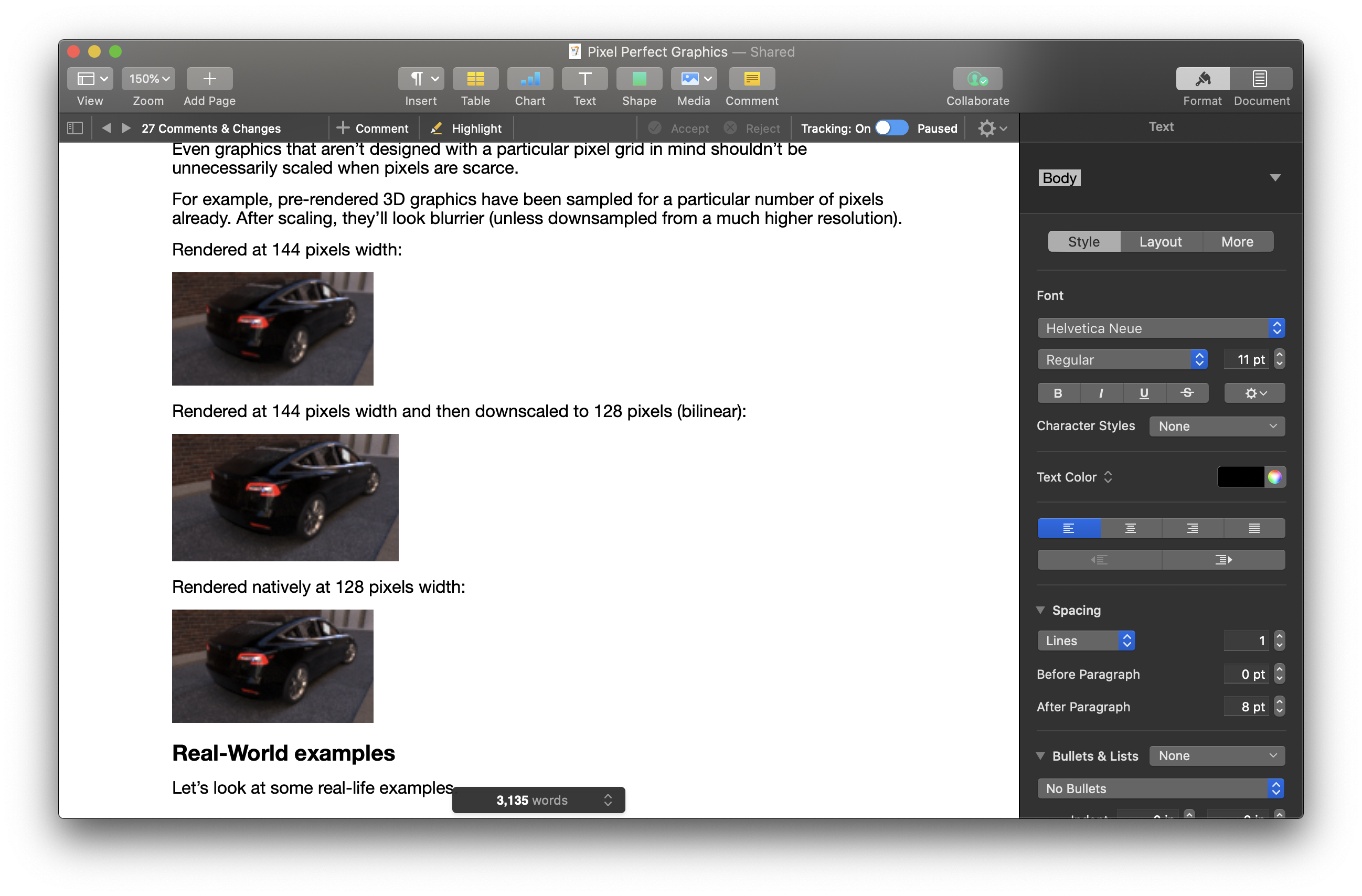
Even graphics that aren’t designed with a particular pixel grid in mind shouldn’t be unnecessarily scaled when pixels are scarce. This applies to complex, 3D perspective images where features cannot easily be aligned with the pixel grid.
For example, pre-rendered 3D graphics have been sampled for a particular number of pixels already. After scaling, they’ll look blurrier (unless downsampled from a much higher resolution).
Rendered at 144 pixels width:

Rendered at 144 pixels width and then downscaled to 128 pixels (bilinear):

Rendered natively at 128 pixels width:

Real-World examples
Let’s look at some real-life examples.
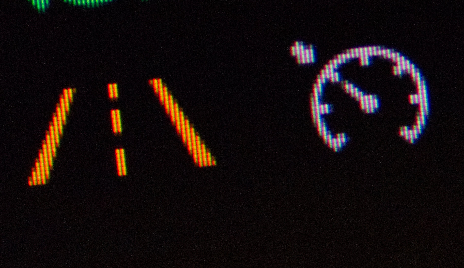
This is a closeup of the infotainment status bar in my Volkswagen Tiguan. Notice the icons being designed for the pixel size and pattern.

Same goes for the instrument cluster icons. Note, how all the indices on the little speedometer have the same visual weight (same number of pixels) and the street is symmetrical on the pixel level.
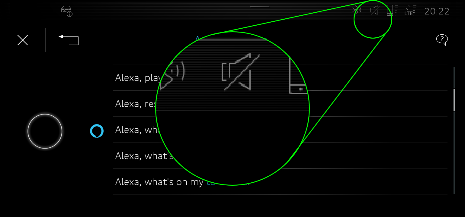
I’ve worked on the graphics for the following infotainment systems, but the images are available for editorial use on audi-mediaservices.com.
This is the head unit in an Audi e-Tron. Notice the pixel-perfect stripe pattern at the top.
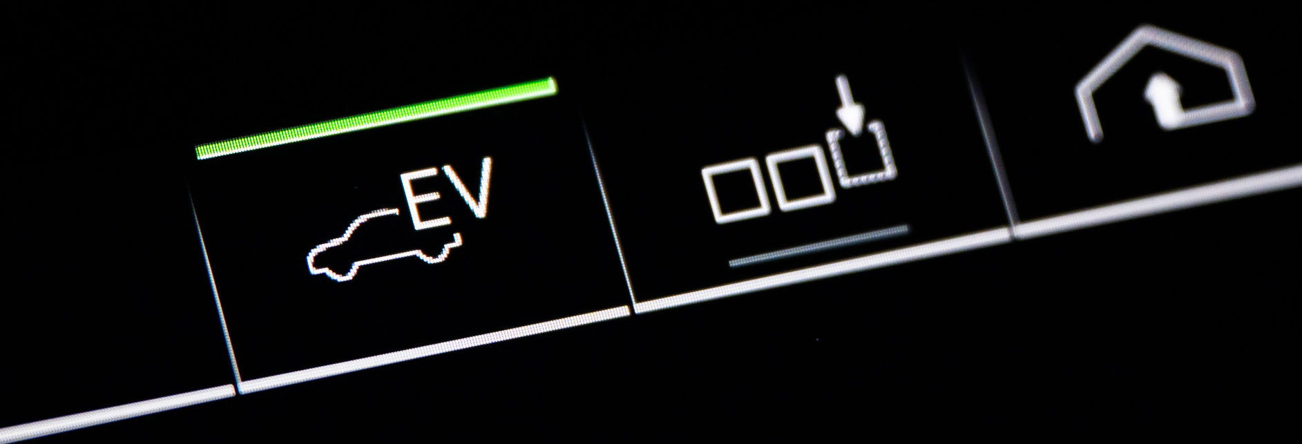
This is the infotainment quick access bar in an Audi A7 Sportback TFSI e: The lines betwen the icons are exactly one pixel, 3 pixels at the bottom. icons are pixel-aligned.
Those are automotive displays. But is there a benefit of pixel-perfect graphics design in a desktop computer OS?
I don’t have to look far. Let’s look at the icons of the application I’m using to write this post, (Apple’s Pages).
… look at those pixel-level details:


A display with over 14 million pixels and designers still design icons pixel-perfectly! Even with “retina displays”, we don’t have enough pixel density for pixel-perfect graphics not to make a difference.
Summary and Future Outlook
Continuing the developments in display and rendering technology, we will, eventually, end up with sufficiently high resolution displays that pixel-perfect design simply doesn’t matter.
We are not there yet. Due to the nature of human perception (where a very sensitive section of the human eye “scans” a larger area), we’ll need much higher resolution displays that are currently not available (particularly not for embedded systems) to not require pixel-perfect rendering.
Until then, to reach maximum graphical fidelity on embedded displays:
- … rasterize graphics in the target resolution and avoid re-sampling.
- … design graphics with small details with the target resolution in mind. Pixel-perfect graphics can be created using both vector and pixel pipelines and storage formats.
Pixel-perfect design doesn’t mean that every possible arrangement of graphics in a system need to be defined. Pixel-perfect or not, it’s not efficient to create the specification of the UI design for a system by meticulously creating a photoshop document of every possible screen.
The key is to implement asset pipelines that can efficiently handle pixel-perfect graphics for different displays while making use of procedural generation and re-useable assets wherever possible.
Leave a Reply